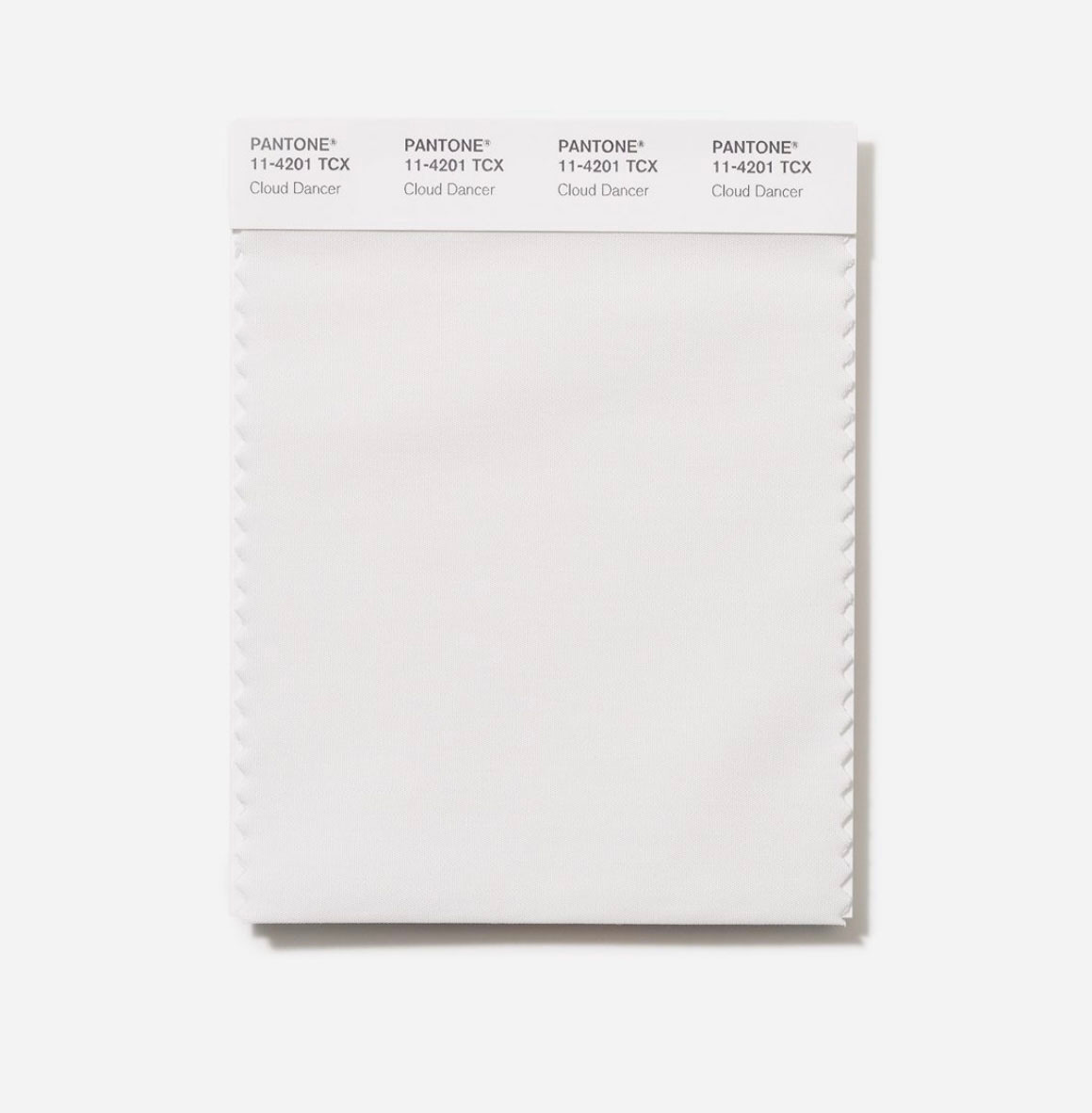
Cloud Dancer 11-4201
In response to the Pantone Color of the Year 2026.

So Pantone have chosen a shade of WHITE for the colour for 2026. After months of internal meetings and research, the team at Pantone have chosen Cloud Dancer 11-4201 as their most influential and important colour for the coming year. As expected, social media has been saturated with responses to this colour decision – both positive and negative – so is white a radical/provocative decision, or is it bland, boring and totally lacking in awareness?
I am fascinated that a colour can evoke such a passionate response. Pantone have said it is “A lofty white whose aerated presence acts as a whisper of peace in a noisy world” – the internet has responded with an outpouring of rage against Cloud Dancer calling it everything from ‘a tepid coat of whitewash’ to a representation of white supremacy in the western world today, a new word has even been invented as they say the colour is ‘Pantonedeaf’.
My friends are asking me what I think of this decision - I look around my house and realise I cannot see a single wall painted white! Yes there are everyday things in my home that are white – white cotton bed sheets, white ceramic bowl for my morning porridge, white thermal vest to wear on a very whitened foggy December morning in Sussex. White is timeless, useful colour, a background upon which to layer and build colours – a blank canvas that will hold any palette that you may choose – but should it be the ‘Color of the Year?’
Is white an absence of colour – is white even an actual colour? How can Pantone choose a non-colour for their ‘Color of the Year?’ Pantone say it is a “Structural color whose versatility provides scaffolding for the color spectrum, allowing all colors to shine.” Most of you know that – although I create colours for the future – I am not a fan of the idea that a single colour can be used by everyone at the same time. We live in a colourful, chaotic world, and I encourage my clients to work with multiple beautiful colours that reflect their needs, their products and their beliefs. Colour is a powerful emotional tool, it builds atmosphere, evokes deep feelings and emotional responses; choosing the right colours is absolutely crucial to the future of good design.
All colour decision making starts with a feeling, a mood or an idea. In this era of rapid transformation, information overload, climate disasters, war and political unrest – I can see the need for calm, understated colours. But the question remains – is white a colour choice – or is it a result of the latest global pandemic – are we all suffering from ‘Chromophobia’? (There is a documented movement away from using bright colours in design in the US and the UK; in the last 30 years interiors have become grey, cars are white, silver or black, the use of bright yellow, orange, red, or bright blue has dwindled since the 1970’s, I may well write a piece about my thoughts on this in 2026.)
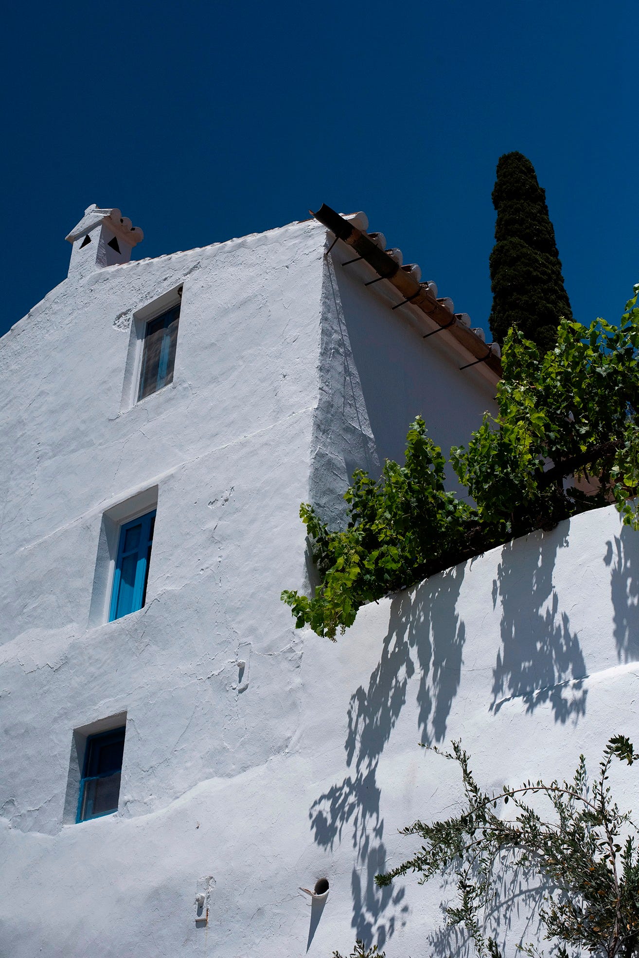
I am captivated by how this story of white is unfolding. I see a place for white in design – a broderie anglais shirt, a whitewashed house on a Greek Island (see my story ‘Hydra’ in Luminary Issue 33) or a vintage linen tablecloth. Last week I was asked to comment for a piece on the use of whites in interiors for the UK publication Living Etc (– at that time I was blissfully unaware of the Pantone decision.)
“We’ve been through a long period of people craving calm, simplicity, and a sense of reset, and white has naturally become a language for that,” colour forecaster Anna Starmer of Luminary Colour. “It offers breathing space, particularly in a world that feels visually and emotionally saturated.”
“But the ‘trend’ isn’t really about minimalism,” Anna adds. “It’s about people wanting rooms that feel restorative, and white, when used with intelligence and sensitivity, can deliver a kind of chromatic quiet that people instinctively gravitate towards. At the same time, we’re seeing a move away from cold, blue-based whites to warmer, more natural tones, whites with clay, chalk, or linen-like undertones.”
Just as in shades of other colours, Anna Starmer says that the emotion of white isn’t one-dimensional. “A soft, warm white can feel nurturing and gentle, like morning light; a crisp, bright white can feel invigorating and architectural; and a chalky, mineral white can create contemplation and calm,” she says. “We often talk about colour as emotion, but white holds just as much depth. It’s the colour that shapes atmosphere more quietly than any other.”
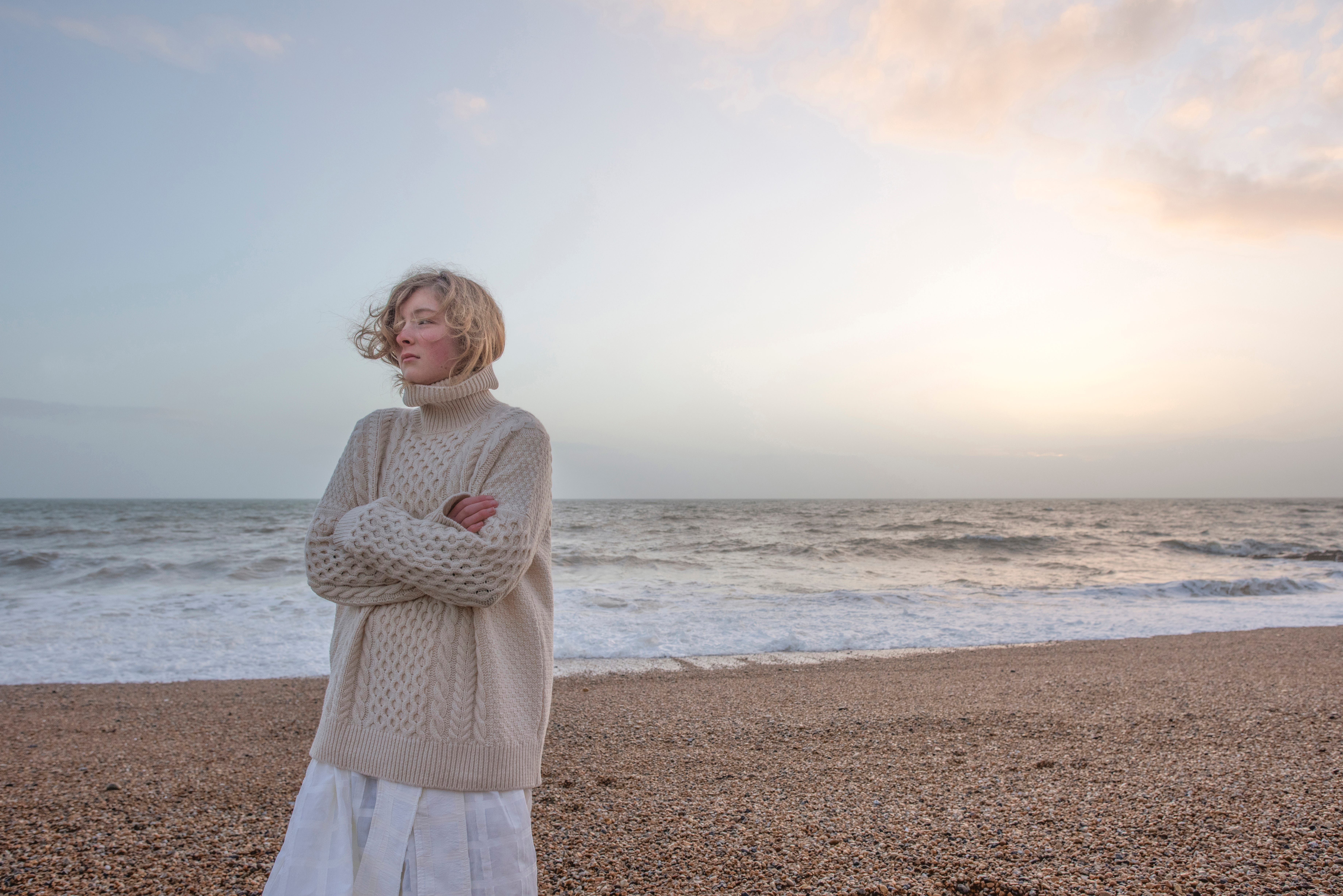
For me – colours start in nature and in the way that we all live our lives. White is the sunlight filtering through curtains – or the flat foggy grey-white sky that frames the leafless trees on a moody December forest walk. White clouds skidding across a Mediterranean blue-violet sky, white bowls filled with olives and tomatoes in the summer, white knitted socks in white furry snow boots. White needs texture, surface and materiality to bring it to life. White needs storytelling to elevate it from bland, boring, nothingness – to elegant, timeless and beautiful.
“My relationship with white is always contextual,” says Anna Starmer. “I think about how the light moves through a room over the day, the textures in the space, and the natural world outside the windows. White isn’t static, it’s a colour that responds.”
It is not a fear of colour that has inspired this decision from Pantone, or an anti-colour manifesto. I feel it is a calling to rethink how we use colour, what is important and what colour means to each of us. Colour does not have to be bright, saturated and intense – gentle shades can be just as powerful. In every colour decision we make today we also must consider the impact upon our environment, the questions around ‘Where does that colour come from?’ or ‘How was that colour made?’ must be forefront when planning and choosing colours today.
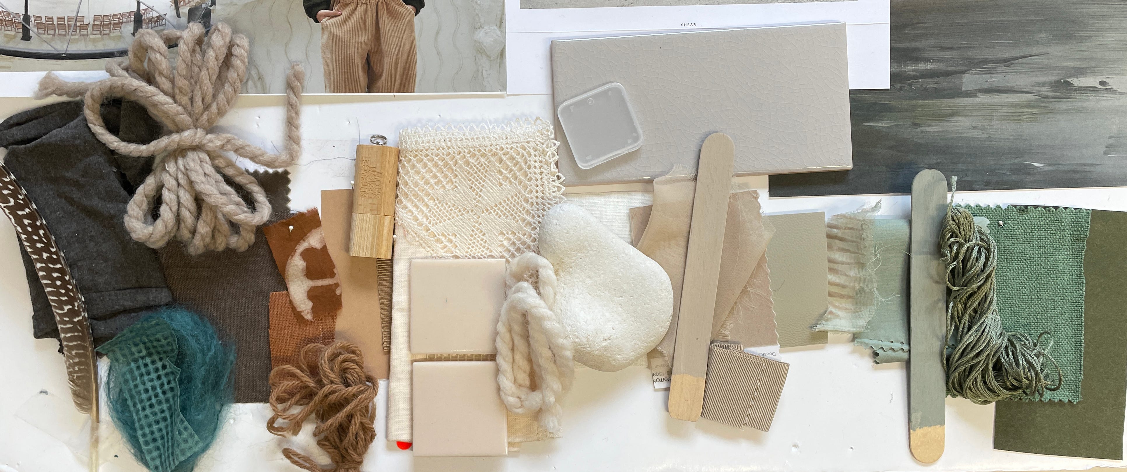
I have seen little written about the truth of ‘white’ colours and how they are achieved in materiality. White as a ‘colour’ is often achieved through harsh processes, chemical bleaching agents strip colour from natural fibres, and devastating mineral mining is needed to produce white paint. Titanium Dioxide or TiO2 is used almost universally throughout the paint industry, the extraction and processing of this ingredient have had a significant environmental impact. Titanium dioxide (TiO2) is in the process of being classified as a suspected carcinogenic substance. In recent years I have been working with clients to produce palettes of ‘uncoloured’ raw materials – like soft tinted natural wool colours, which require no bleaching or dyeing to reach the preferred ‘white’ colourways.
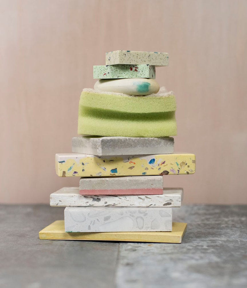
In Luminary Issue 32 I have a story called ‘LowTech’ a palette of pale shades, smudged off-whites and nuanced pastels. “New materiality drives a circular palette of blended softened colours that are derived from raw and undyed waste streams. Recycled plastic coat hangers, factory floor textile scraps and waste paper, are broken down, shredded and reformed into brave new realms of colours.”
White – is it a fear of colour or an attack of Chromophobia – or is it a calm, sensitive decision? Would it be my choice for the Colour of the Year – probably not! Right now we really need colours that ignite powerful response and call us to fall madly in love with the world again, colours that inspire dramatic shifts in HOW we design and what we choose to create for the future. I might go with matcha green, or dark madder root red, colours from my forest walk this morning of hawthorn berry and evergreen holly leaf.
As Hugh Metcalf says in Living Etc “Cloud Dancer manages to be at once such an ordinary and such an extraordinary choice that I can’t help but admire Pantone’s boldness.” This 2026 ‘Color of the Year’ is forcing us all to look at the pale, neutral colourless colour in a new light. Are we elevating a basic shade – or are we focusing on an absence, a lack, on something missing from our modern world? Once again I am in awe of the power of colour.